Pages

Wednesday, May 30, 2012

Summer Notebook Cover

My last notebook is almost full so time for a fresh notebook and fresh cover.  I use these for to-do lists and other daily notes.  My Stampin' Up! wish list is already written in the back :-)

I did a video a few months ago on creating the cover if you don't have a notebook style hole punch that matches the notebook you are covering.  This technique works with any type of notebook.  It's my most watched video. Here's the link:  Spiral Notebook Cover.

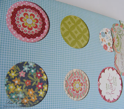
Before I fitted the cover of this version, I used my Cricut to cut 6 large circles to allow my pattern papers and embellishments to show through.  This trend of having elements behind your die cuts was a challenge over at Two Peas a few weeks ago I just didn't have time to do then.  I thought it would make an interesting cover and allow the notebook to have some layers while still lying very flat.  I also cut a layer of thin chipboard with the same circle pattern and placed it under this blue paper to give a little more depth.

It was so tempting to put buttons in those cutouts!  I have to resist to keep this really usable.


The stamped image is from Stampin' Up! and the stickers are My Mind's Eye So Sophie.  I used lots of happy summer colors though I'm sure this one will last me through fall at least.

Thanks for visiting!

Tuesday, May 29, 2012

Making a Mask


I should have taken one of those 'what's on your worktable' photos on Saturday.  I had these cards and some other projects in progress. It was a mess!  Many ideas had come to me at once which I loved.  It seemed that for the last few weeks I haven't been that inspired.  One of these new ideas didn't quite pan out (OK, everything got crumbled up and thrown in the trash) but the others were finished and will be along as the week goes on.

I was looking for a good material for making my own reusable masks.  An easy way to make a reusable mask is to use your Cricut or other cutting device to cut on out of transparency film.  The same film you use for printing transparencies works great as a mask.  It is thin and won't curl up when spritzed the way papers will.


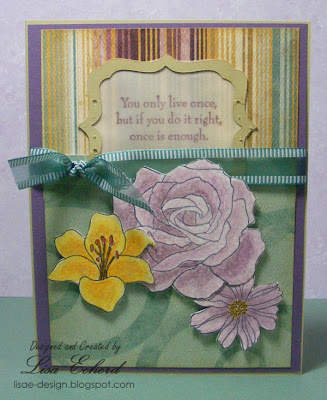
I cut the mask for the background of this card using the Storybook Cartridge and my Cricut.  Here is the  the transparency mask I'm saving so it can be used again on other cards.  It is a little stained but still usable.


In my quest for something good to use for masks, I tried vellum.  It turned out to be horrible for a mask as it curls immediately when you spritz it with a mist.  However, I cut this same image from a printed vellum and got a really pretty result so I used it as a background.


The flower is made with plain old muslin.  I dyed it with some SU! ink mixed with water and stamped the dried fabric with a background image.  The brad is from Teresa Collins and the trim from Webster's pages.


What did you do for Memorial Day weekend - relax, travel, craft?  Hope it was a good kickoff for summer.  Thanks for stopping by today!

Saturday, May 26, 2012

Almost 7


Wrapping up my stepdaughter's wedding photos from 2010 with this layout of Nai Nai in her pretty blue dress.  She wasn't in the wedding but she certainly matched and her doll had a coordinating smocked dress, also.  I have no idea where they found this; it was adorable.  Her birthday was just days away, thus the title.


I used rub-ons to find some key words to describe her.  A wonderful thing about family events is getting to see the children.  Living three states away, we don't get to see them very often.  "Grampa" and I watched after them while the adults were at the bachelor and bachelorette parties the night before the wedding. We originally planned on taking them out for the evening but ended up in a hotel room with the kids making a fort out of hotel bedding.  Why were we such fuddy duddy baby sitters?  There was a tornado and torrential rains!  The kids didn't seem to mind.  What a weekend!


Some Cosmo Cricket Material girl paper and flowers from Stampin' Up! rounded out the page.  Thanks for stopping by!

Thursday, May 24, 2012

The Season ends and a New Catalog begins


Today's card features Season of Friendship which Stampin' Up! is retiring at the end of this month.  I've always enjoyed this set for both cards and scrapbooks.

My new Stampin' Up! catalog arrived this week.  As usual I have lots of opinions about the catalog.  Here are my thoughts and some info if you haven't seen it already.

The Best
Almost all stamps are now available in 'clear' (really cling) stamps as well as wood mounted.  The only exceptions I noticed were the large background stamps.  So I now have some things on my wish list that I'd previously passed over as too expensive.  Having a choice for both new and older sets is a really great thing!

Also, many prices have remained the same including ink pads, paper, envelopes and dimensionals.  I didn't check everything but those I know by heart.  I applaud SU! for doing this.  It seems like my grocery store is raising prices weekly so when we can go multiple years without a price increase on something, I'm delighted.  (Pattern paper did go up $1 per pack.)

The Good
The layout and photography of the new catalog are even more professional. Always at a high standard, they have turned it up a notch this year.  I know some people aren't pleased with the closeup photos and not being able to see an entire project.  I believe you can see enough of any of the projects to make your own or use them for inspiration so it doesn't bother me.  I like the angles of the photos.   The cover no longer says "idea book" but there are plenty of ideas.

They moved the hostess sets to the end of the catalog so you jump right into holiday and things to purchase.

Personally, I like the designer paper a lot more this year.  And I also like the Simply Scrappin' kit choices.

The Not-so-good
There are two pages at the beginning of the catalog with some of the 'tools' and then the rest are at the end.  It is confusing.  Why not just put them all together?  If they were going to do this it would have been a good place to explain the new ink pads.  There is no explanation in the catalog.  I think they just changed the pad and not the actual ink except for a few colors.  Hopefully more info on this will be made available when ordering time arrives.

Markers and 12x12 paper are no longer available in all individual colors.  A few colors are still available for individual order but not that many so there are markers I'll probably never get now.  Thank goodness you can still get Crumb Cake (kraft) in a 12x12 individual pack.

The Really Annoying
The ink colors are once again printed teeny tiny so they are hard to see.  Last year they used those leaves to keep with their growing theme, this year they are using a different shape but the effect is the same.  It is very hard to see what a color really looks like.  In a 200 page catalog that bases everything on color families, you can find space to print the colors at least an inch square!


One other thing that really bugged me was, I think, supposed to be a feature.  Every so often, they will have a group of projects all made out of the same colors.  The colors are shown in blocks, but they didn't label the blocks!  So you don't know what the colors really are.  Some of their colors are so close it is hard to tell.


Whether you like the stamp choices is definitely personal.  I found several things in Elements I like and one holiday set but am not finding much in the other categories.  SU! needs to shake things up a bit on their designs.  Too many of the new sets look too much like those that were discontinued to get me to purchase - but again, this is opinion for sure.

There are many good choices here in a very eye pleasing catalog (and idea book).  If you are a stamper, SU! is always a good option.

Wednesday, May 23, 2012

2010-2012 In Colors


A new Stampin' Up! catalog term begins next month and so do new In Colors.  So five In Colors are retiring including the ones in this card - Peach Parfait, Pear Pizzazz and Blush Blossom.  I used Splitcoast stampers sketch for my layout.

The 'berries' are some pink stickles in this very simple card.  My challenge was to make a card using the only one of these In Colors I had the ink for.  I have paper in all the colors but only liked one of them enough to buy the ink - Pear Pizzazz.

Tomorrow I'll have another card and some thoughts on the new catalog.

Tuesday, May 22, 2012

Priceless Memories


Before we get to the layouts, we pause for this important weather announcement...

We are in the midst of tornado season though so much of the country started early.  There was one that did quite a bit of damage about 30 miles from us in January!  Next month brings us Hurricane season and some of the country is already so dry they are starting wild fires.

No, you didn't click on the Weather Channel by mistake.  I'm mentioning all these awful things to put a little fright into you and to me.  Why?  Because our photos are triggers of our most precious memories.  Are your photos safe from disaster?

Here are some tips for taking care of those precious photos:

1.  Scan old pictures or take a picture of them if you don't have a scanner.  It may not be as good as the original - although my cheap all-in-one printer/scanner does a pretty good job. It is better to have a photo of a photo than none at all.

2.  Back up your digital photos and scans.   If you take photos with your cell phone, download them.  A cell phone is way too easy to lose.

3.  Store the backup somewhere besides your own home.  Note the natural disasters mentioned above.  A good backup is an off-site backup. It is what corporations do and it is what we need to do also.  Consider a bank safety deposit box.  You may also store backups with a family member who lives a good distance away from you.  On-line backup services may be a good option for you as well.

4.  If you have extra prints lying around, those too can be stored off-site.  Perhaps doing a photo swap with a family member for those extra school pictures or other extra photos that you don't need. Keep a box of their keepsakes safe at your home and let them keep a box of yours.

5.  Remember that all media gets dated.  By this I mean that if you backed up data a long time ago on a 3 1/2" disk, you might have a lot of trouble finding a computer to off load it onto should you need it.  Your backup system will need to be revisited every few years.  Is this a lot of trouble?  It is some aggravation but think about those people you see on the news hunting through the wreckage of their home after a tornado to find just a few photos or mementos.

I know this isn't new information, but I for one am guilty of not having everything backed up.  I have a lot of it scanned and stored in a safety deposit box but not everything so this is a reminder to me as well to keep working on recording those memories and keeping them safe.

I truly hope you never need a backup of your photos but if you do, I hope you will have those precious memories preserved.

Now that I'm done preaching, onto my layouts for today...


For this layout, I used the originals - after I scanned them.  Often the thing I notice most in old photos is not the main subject which I guess was supposed to be me as a baby but the other people and the background.  These photos tell me a lot about my parents and my home growing up.

Look how thin my Mother is!  I was only 3 or 4 months old here - the photo isn't dated, but I can tell from the flowers.  She certainly got her figure back in record time.  She was and is such a beautiful woman.  Also Mother is obviously very comfortable as a new Mom, my Dad looks a little more uncertain of having a baby in his arms. Unfortunately, I inherited my Mother's photographic ability :-)

I did "The House that Built Me" page first and I'm glad.  It turned out pretty busy so I knew the other one needed to be a lot simpler.  The major embellishment here is the hand stitching.  I was inspired by all the stitching I've been seeing lately on Sue's blog.

While all these pictures are of me as a baby and a toddler, I was more interested in the setting. Each of these photos remind me of the home I grew up in.  My parents still live in that house but you wouldn't recognize it as the same one.  They did two major remodels.  Since they owned a carpet, wallpaper and window treatment business, Mother redecorated our home a couple of times when I was growing up and again after she retired.  So all those original furnishings and finishes are gone or buried under new wall paper and carpet.  I don't just barely remember some of this.

Both layouts were completed with papers mostly from Echo Park's This and That Graceful collection that I got from ArtfulDelight.  These papers have a real 50's vintage look.  My parents house was constructed in the late 1950's (I wasn't constructed until a few years later).


The idea for putting the photos in the 'house' came from the fall Scrapbooking and Beyond issue.  The photo frame was small in their layout, more of an embellishment.  I decided to fill all the squares with photos.  The 4 square design was cut on the Cricut with SCAL software from chipboard and then a woodgrain pattern paper that reminded me of the paneling in our den.  The roof is courtesy of the Scoreboard and then cutting paper into strips and layering.  Once I got started layering all the stickers and papers I liked, I just couldn't stop!

The House title is from the Miranda Lambert song.  In the song she goes back to her childhood home. I see my childhood home all the time as my parents live less than a mile away.  Still with these photos I can 'go back' to the original house look and a different time.

Thanks for visiting today!

Friday, May 18, 2012

Rainy's Card Sketch


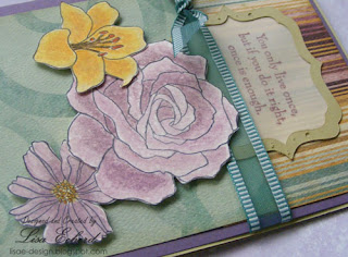
May has several birthdays for us.  I made two of these - one for my sister-in-law and one for a friend.   I love this set - Fifth Avenue Floral by Stampin' Up!  It is on the discontinued list but I'm sure we will see it in use for a long time as it is such a popular and versatile stamp set.


For the arrangement of this card, I used the sketch from Rainy Day Creations blog found here.  I did shorten the panel on top and use a velum insert into the frame cut with the Cricut.  This keeps more of the My Mind's Eye stripe showing.  The back side of that stripe is the green on the bottom.

Thanks for visiting today and check out Rainy (Susan's) blog for the sketch and a chance at her giveaway.

Hope you have a great weekend!

Wednesday, May 16, 2012

More Wedding Pages


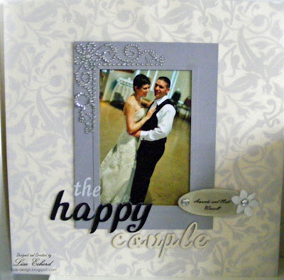
Almost finished with these wedding pages. Here are the happy bride and groom. I'm impressed with the photographer's ability to get their photo and block out all the background stuff.  I'm unimpressed with my ability to photograph this page.  The printed transparency makes a very pretty if difficult to photograph backdrop.

For this page on the Rehearsal, I did a photo collage in Photoshop Elements, a technique I hadn't done in awhile.  It had been so long I had to strain my little brain to remember how to create a drop shadow.


The peacock feather was part of the wedding keepsakes. She used peacocks for her theme and thus the teal and blue color scheme.  The photographer did the top 5 photos here and I did the bottom two including the one with my parents and Lenny.  I took tons of photos of the cupcake tree and flowers but hers were much better.  A few simple embellishments were all these photos needed.

Thanks for stopping by today!


Tuesday, May 15, 2012

Envelope Closure


Just a little tip today on creating a special envelope closure.  Shop your die cut stash and put one to work as a seal.  The die cut above is from a Valentine collection by American Crafts but I used it for Mother's Day.

Use Tombow glue on the die cut adhering part of the die cut to the top of the envelope and letting the other half hang off the edge until the glue dries.  The part that isn't adhered will have tacky glue.  When you press your envelope closed, the tacky part sticks but can be easily opened and restuck.


Note:  This is only good for hand delivered cards.  It would not work for those going through the mail as the card would come opened in processing.

Thanks for stopping by today!

Monday, May 14, 2012

That 70's Look


This is one of those photos that could tell a dozen stories - friends of the family, my Dad, the setting.  For this layout I started with an easy one - the 70's look.  In the mid-70's we wore a lot of red white and blue in honor of the bicentennial.  Bell bottoms and polyester were popular.  The little purse in the photo brings back a lot of memories.  If you experienced this decade, did you have one of these?  The purse had wooden handles and a buttoned on cover.  You could buy covers in different colors to change your look.  My aunt stitched up a bunch of reversible ones for me to change out depending on my outfit.

I used to have a passion for pocketbooks.  Now when I finally find one that meets my requirements, I carry it it until it falls apart!  Funny how our tastes and priorities can change.


The Little Yellow Bicycle Saturday's collection had the perfect colors and embellishments for this page.  The red paisley reminds me of bandannas - another 70's staple.  I used to wear them around my head like a head band.  I'm glad that is a look that hasn't come back!


This denim trim with the grommets has been in my stash for years.  I think it came from Wal-mart.

Thanks for dropping by today and revisting 70's fashion with me.

Saturday, May 12, 2012

To all the Mothers...

and step-mothers and grandmothers and great grandmothers and all the mothers-to-be, Happy Mother's Day!


For my Mother, I used Echo Park's Graceful stickers and several die cuts from my Cricut to create this paper pieced card.  My Mother really isn't a pink person but I couldn't resist the picket fence and the little bird stickers. She is a wonderful gardener and has pink roses blooming on her trellis right now.


The MS Scoreboard got lots of use here including the brick work.  I scored a scrap of River Rock cardstock every half inch and then cut it into 1/4 inch strips.  I alternated placement of the strips as I glued them down - a super easy brick pattern.


And for the inside...


Hope you have a wonderful weekend!

Friday, May 11, 2012

Creating a Pieced Chevron Pattern


Over 20 years ago when we started dating, I bet our friends were shaking their heads thinking, "those two don't go together."  It might have seemed that way, but we do truly fit.  We think alike on many things.  We have some of the same strengths but where we differ we mostly complement, not clash.

Fitting together little pieces of paper was part of the design for this page I made for Two Peas NSD challenge using chevrons.  The challenges extend through this Sunday the 13th.  I know I've seen pages with this type of piecing but I could not find one to link up so I'm not sure what specific page inspired me.  (I have started Pinterest boards just for the purpose of keeping track and providing credit for my inspiration.  Unfortunately, I never linked one of these.)  


Anyway, I still had to figure out how to do this. I wanted my little strips to look like they were quilted and all the seams to match up. I used a quilting technique based on foundation piecing where you sew your fabric strips to a marked foundation then piece the squares together.  In this case, I glued my strips down and voila!  they matched!  I'm a little surprised as I wasn't super picky on my cutting.

Here is a video of the process.  I'll warn you I was holding the camera rather than having it mounted so it is a little off in places.  I wasn't sure I how this was going to turn out so I was just capturing it 'just in case.'

Watch at YouTube


To finish the layout, I stitched over the chevron and added some more stitching lines.  To keep those lines in a chevron pattern, I used the cutting pattern from the video as a guide similar to how I did the argyle pattern in this video.


The large yellow flower is from the Artfuldelight May kit.  I made the rest with the Cricut's Accent Essentials cartridge.

The photo was taken by my friend Karen when we visited her in Greenville, NC a few weeks ago. It was picture perfect weather and we took a crafting break for a walk around the lovely Eastern Carolina University campus.

Thanks for visiting today!  I'll be back later with my Mother's day card I've yet to finish.  Yikes!

Thursday, May 10, 2012

Happy Birthday, Earthling


I CASEd this card from the January Cricut magazine.  Isn't he a cute little alien?  Good thing I had an example as I wouldn't have had a clue how to make one.  Their version was cut with a cartridge.  I did mine with punches and hand cutting.  To add some extra dimension and shine, I went over many of the pieces with a coat of Crystal Effects (like Glossy Accents but from Stampin' Up!).  The legs and arms are some yellow trim.

Their version had something about the birthday being 'out of this world.'  I saved that for the inside and used a star background made by stamping and embossing a few stars with silver embossing powder.  October Afternoon stickers finished off my message.

The card went to Dillon for his 11th birthday.  He will soon be too old (maybe he already is?) for such cards so I'll have to enjoy making things like this while I can.

Oh and we have to brag on Dillon.  He placed 2nd in the Physical Science competition in his region of Arkansas.  He was the first one from his school to ever place in this competition.  His entry was a comparison of the strength of homemade glue versus store-bought glue under various degrees of pressure.  He had to measure and record the pressure.

(I would share pictures but my stepdaughter didn't take her camera!  I'm beginning to lighten up on my parents for not taking photos of me as a child.)

Congratulations, Dillon!

Tuesday, May 8, 2012

Bookmark

I'm still a traditionalist.  I read printed and bound books.  If I traveled more, particularly if I commuted via subway or was a frequent flyer, I could certainly see the value in an e-reader.  The ability to change point size might come in handy some day (soon?) as my eyes age.  For now though, I'm a frugal person who still loves to explore the local library and check out books for free.  I like the feel of a regular hardback book.  So I still need bookmarks.

If you do or would like to make a simple gift, here is a video of the bookmark we made last night at card class.  This will fit in Stampin' Up!'s small open end envelopes for mailing or you can make your own envelope - see last week's video here on the blog.

I think this would make a good teacher's gift or for a young reader as they are about to have a summer free for reading.  That brings back memories.  I loved to read in the summer, taking my time reading just what I wanted.

Watch at YouTube


Thanks for watching!

Ingredients:  Stamps:  Big Flowers by Stampin' Up!; Perspectives by Technique Tuesday
Cardstock:  Kiwi Kiss and Marina Mist by SU!
Ribbon:  Kiwi Kiss by Stampin' Up!
Brads:  Paper Studio


Sunday, May 6, 2012

Crafty Days


What is better than spending some relaxing time with a friend making cards?  Not much.  My friend's husband took these photos of us on Easter weekend.

Here is the journaling from my layout:


It was more than making cards. 
It was the luxury of drifting in and out of a room, filled with supplies, when we felt like it. 
It was talking or working in silence.
It was sharing ideas, having someone to complain to about what didn’t work and someone to praise what did. 
It wasn’t work or a chore; it was creative and relaxing. 
It was a lovely crafting weekend with my best friend.


The layout is for Two Peas's NSD challenge to use bright colors.  This isn't a palette I gravitate towards in scrapbooking - more in cards.  The photos went very well with yellow, turquoise and a touch of red which I also pulled from the circle paper from Echo Park.  Some of the circle embellishments are stamped with a retired Stampin' Up! set 'Big Flowers.'  It has gotten a lot of action on my scrapbook pages.

Thanks for visiting today!  Hope you are having a fun weekend with those you love.

Saturday, May 5, 2012

A day in May


Spring has been early this year - really early.  The spirea bushes that don't normally bloom until now are already finished.  We have very ripe strawberries and peonies popping open every day.

This layout is for two challenges - Artfuldelight's monthly sketch challenge and Two Peas National Scrapbooking Day Make It Your Own challenge.  I also used quite a bit of the May Artfuldelight kit on this page.


I'm so glad I read about the Make It Your Own challenge.  Yesterday when I was pulling together elements for this layout, I had stamped the banner flags with letters only.  That was how I planned to leave them until inspired by the challenge to add some paint and then stamp on a little vine in green ink.  They look so much better.


Embellishments for a page about flowers can be challenging.  Everything that is feminine enough looks too much like a flower.  A few of the stickers from the kit - Echo Park's This and That Graceful  collection - worked out nicely.  I added a stamped message on a Cricut cut label.


Thanks for stopping by and be sure to check out the other challenges at Two Peas this weekend.  There are prizes up for grabs and lots of inspiration.


Ingredients:  Stamps:  Faith in Nature by Stampin' Up!
Cartridge:  Storybook
Canvas Banner by Prima
DSP:  Echo Park's This and That Graceful collection and Cake Stand by Crate Paper

Friday, May 4, 2012

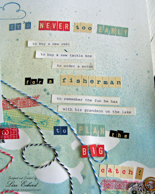
It's never too early...


It's never too early for a fisherman to start the dream...

It's never to early to buy out the sports department at Walmart to make the dream come true :-)

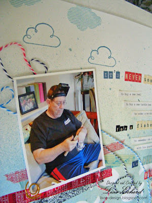
Lenny is really looking forward to going fishing with Dillon this summer.

I had a lot of fun creating this page.  I was inspired by a blog I've been following:  purplemailbox  Ashli has so many cool pages.  She shows all the steps in her process.


Guess what was the toughest part of this page?  Making the fish masks.  I couldn't find a fish die cut image for my Cricut that I liked so I finally drew my own fish and just cut them out by hand.  I must have drawn two dozen fish before I found one I liked.  After that it was all play time.

The page is certainly a departure and that is what so much fun about it for me.  There isn't a scrap of pattern paper; I used every Washi tape I had.  The twine is attached by spraying pieces with photo spray adhesive and then arranging them on the paper - a technique I saw at Shimelle.com


What a wonderful hobby we have to be able to experiment with all kinds of styles.  Thanks for stopping by!

Ingredients:  Washi Tapes Bazzill and Hamblly
Twine:  Doodlebug
Cloud stamps:  Imaginese Clouds; Hampton Arts Whoo Loves You?
Stickers: October Afternoon


Wednesday, May 2, 2012

Sisters


Amanda and Jaime, my stepdaughters, are not just sisters but great friends.  I loved this photo from Amanda's wedding.

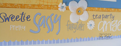
One of the challenges I've had for these wedding pages is finding papers with the royal blue color from the wedding.  For the page, I used this paper from the Little Yellow Bicycle Saturdays collection.  Most of the papers are 'blue jean' themed - a good color but not right for weddings.  This one has flowers on both sides.  Here is a corner of it as it comes from the manufacturer.


It was a little plain, so I colored in some of the flowers and leaves with Stampin' Up! markers to match the wedding colors.


The blue paper for the die cut letters is some very old vellum.  I bet I've had that stuff over 10 years!  Anyway, it was the perfect color.

Thanks for visiting today!

Ingredients:  Pick a Posy/Meet me in the Meadow by Little Yellow Bicycle
Markers from Stampin' Up!
Storybook cartridge from Cricut
Related Posts Plugin for WordPress, Blogger...